Today, we will discuss another type of combined graphs in IELTS Writing Task 1. Previously, we have discussed other types of combined graph in these articles:
Now, take a look at a sample combined graphs below.
The structure of the writing for sample diagram above is pretty much the same as the one that I have explained in the previous article, but I will explain it again just to refresh our memory. The writing structure can be described as follows:
Paragraph 1
- Introduction
- Explaining variables
- Explaining major trend
Paragraph 2
- Giving detailed information of the first graph (percentage, proportion, lowest/highest, increase/decrease)
Paragraph 3
- Giving detailed information of the second graph (percentage, proportion, lowest/highest, increase/decrease)
Basically, we are going to explain the line graph and the table in separate paragraphs by paying attention to the major trend of each graph. Now, let's try doing the writing step by step.
Paragraph 1
Introduce the Graph
As usual, we are going to paraphrase the original title first, and then use the paraphrased title to introduce the graph.
- The comparison of local and foreign tourist visiting X island from 2000 until 2005 (the original title of the line graph)
- Four holiday activities in X Island (the original title of the table)
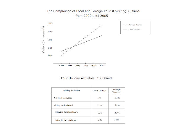
- The line graph compares the number of local and foreign tourists who visited X island in a five-year period starting from 2000, while the table explains how visitors liked to spend their holiday in X island (paraphrased title)
Explain the Variables
After giving a short introduction, we have to explain all variables in the graph. Since we have explained the year (2000-2005) and the two different types of tourists (local tourists and foreign tourists), we now have one piece of information left, which is the number of the tourists. We can explain it this way:
- Units are measured in thousands
Explain the Major Trends
We can use the major trend as a main idea of paragraph two and paragraph three. Basically, we can see that there had been a stable growth in the number of both local and foreign tourists visiting X island. It can also be seen from the table that local tourists like to go to the beach while foreign tourists prefer going to cultural events. You can develop these main ideas by including more detailed information provided in the graph.
Overall, our first paragraph will look like this:
The line graph compares the number of local and foreign tourists who visited X island in a five-year period starting from 2000, while the table explains how visitors like to spend their holiday in X island. Units are measured in thousands.
Paragraph 2
In paragraph two, we are going to give detailed information about the line graph. We can do it as follows:
The line graph shows that there had been a stable growth in the number of both local and foreign tourists visiting X island. In the first year, there were more local tourists that made up 150.000 visitors. The figure slightly increased each year and reached its peak in 2005, representing 350.000 tourists. Starting from 2001, the number of foreign tourists exceeded that of local visitors. Although there were only 100.000 visitors in 2000, the number of tourists from other countries quintupled within a five-year period.
Paragraph 3
In paragraph 3, we have to explain the table the same way we have explained the line graph. The whole paragraph will look like this.
The table outlines several activities that tourists like to do in X island. The data indicates that nearly three-quarter of local visitors like to go to the beach. Culinary became their second most favorite activity. They were not really fond of attending cultural events and going to the wild zoo, which together attracted 5% visitors. Thirty three percent foreign visitors really liked going to cultural events. Nearly 25% of them liked going to the beach. The table also shows that both local and foreign tourists really liked the local culinary.
The whole writing task 1 will look like this:
The line graph compares the number of local and foreign tourists who visited X island in a five-year period starting from 2000, while the table explains how visitors like to spend their holiday in X island. Units are measured in thousands.
The line graph shows that there had been a stable growth in the number of both local and foreign tourists visiting X island. In the first year, there were more local tourists that made up 150.000 visitors. The figure slightly increased each year and reached its peak in 2005, representing 350.000 tourists. Starting from 2001, the number of foreign tourists exceeded that of local visitors. Although there were only 100.000 visitors in 2000, the number of tourists from other countries quintupled within a five-year period.
The table outlines several activities that tourists like to do in X island. The data indicates that nearly three-quarter of local visitors like to go to the beach. Culinary became their second most favorite activity. They were not really fond of attending cultural events and going to the wild zoo, which together attracted 5% visitors. Thirty three percent foreign visitors really liked going to cultural events. Nearly 25% of them liked going to the beach. The table also shows that both local and foreign tourists really liked the local culinary.
Wordcount: 216


No comments:
Post a Comment